
Concept Project
LitMap - Visualising Reading Habits as a Personal World Map
SCOPE
Mobile
YEAR
2025
LitMap is a concept mobile app that turns reading history into a personal world map. Users can discover new literature by geography, track which countries they have explored, and build a visual atlas of their reading life, making progress feel meaningful rather than just a number on a list.

Why This Project?
The Spark
Almost everyone wants to build a reading habit but sustaining it, discovering new things, and actually feeling your progress is a different story. Existing platforms like Goodreads let you track what you've read, but they don't help you understand it. Your data sits in a list, static and flat.
At the same time, habit trackers have shown us something important: people engage far more deeply when their data is visual. You map your runs, you chart your sleep. Reading deserved the same treatment.
LitMap is a concept mobile app that turns your reading history into a personal world map a motivation tool for light readers, a meaningful atlas for heavy ones.
Almost everyone wants to build a reading habit but sustaining it, discovering new things, and actually feeling your progress is a different story. Existing platforms like Goodreads let you track what you've read, but they don't help you understand it. Your data sits in a list, static and flat.
At the same time, habit trackers have shown us something important: people engage far more deeply when their data is visual. You map your runs, you chart your sleep. Reading deserved the same treatment.
LitMap is a concept mobile app that turns your reading history into a personal world map a motivation tool for light readers, a meaningful atlas for heavy ones.
Benchmark
What Are Competitors Doing?
What Are Competitors Doing?
Personal Reading Map
Personal Reading Map
Personal Reading Map
Gamification (Badges, Avatars)
Gamification (Badges, Avatars)
Gamification (Badges, Avatars)
Book Recommendation Algorithm
Book Recommendation Algorithm
Book Recommendation Algorithm
Social Interaction
Social Interaction
Social Interaction
Monthly & Weekly Reading Statistics
Monthly & Weekly Reading Statistics
Monthly & Weekly Reading Statistics
User-Generated Content (Reviews, Notes)
User-Generated Content (Reviews, Notes)
User-Generated Content (Reviews, Notes)
Goodreads
Goodreads
Goodreads
StoryGraph
StoryGraph
StoryGraph
LibraryThing
LibraryThing
LibraryThing
Literal Club
Literal Club
Literal Club
Before shaping the idea further, I looked at existing apps. Goodreads, StoryGraph, LibraryThing, and Literal Club.
The most striking thing in the comparison table: the Personal Reading Map row was empty across all four. Nobody had done this. Gamification, social interaction, reading statistics existed to varying degrees. But nothing turned reading habits into a geographic, visual map.
That gap showed me exactly where LitMap would sit. Not rebuilding what already exists, but entering an unfilled space.
Before shaping the idea further, I looked at existing apps. Goodreads, StoryGraph, LibraryThing, and Literal Club.
The most striking thing in the comparison table: the Personal Reading Map row was empty across all four. Nobody had done this. Gamification, social interaction, reading statistics existed to varying degrees. But nothing turned reading habits into a geographic, visual map.
That gap showed me exactly where LitMap would sit. Not rebuilding what already exists, but entering an unfilled space.
Survey and Findings
Getting to Know the User
Getting to Know the User
Even though this was a concept project, I wanted to run a real user research process. I conducted a survey with 19 participants. My goal wasn't to be validated, it was to be directed.
Participants were between 24–34, with moderate to high interest in world literature, and actively using digital book tracking tools.
Even though this was a concept project, I wanted to run a real user research process. I conducted a survey with 19 participants. My goal wasn't to be validated, it was to be directed.
Participants were between 24–34, with moderate to high interest in world literature, and actively using digital book tracking tools.
Three findings stood out:
Three findings stood out:
Choice overload is a real problem. Users are eager to discover new books and literary genres, but they get lost when they see too many options. "My reading list has piled up and I don't know where to start" came up again and again.
Choice overload is a real problem. Users are eager to discover new books and literary genres, but they get lost when they see too many options. "My reading list has piled up and I don't know where to start" came up again and again.
Social discovery is a strong motivator. 89% of participants said they found it highly interesting to see other users' reading lists and statistics. But existing platforms either don't offer this at all or keep it very surface-level.
Social discovery is a strong motivator. 89% of participants said they found it highly interesting to see other users' reading lists and statistics. But existing platforms either don't offer this at all or keep it very surface-level.
My geographic recommendation hypothesis split 50/50. When I asked whether a book being from a specific country made it more appealing, half the participants said "yes, it's a great way to discover that culture" while the other half said "for me it's about genre, not geography."
My geographic recommendation hypothesis split 50/50. When I asked whether a book being from a specific country made it more appealing, half the participants said "yes, it's a great way to discover that culture" while the other half said "for me it's about genre, not geography."
This finding was initially jarring enough to make me question the entire map concept. But in the end, it led to a much better design decision:
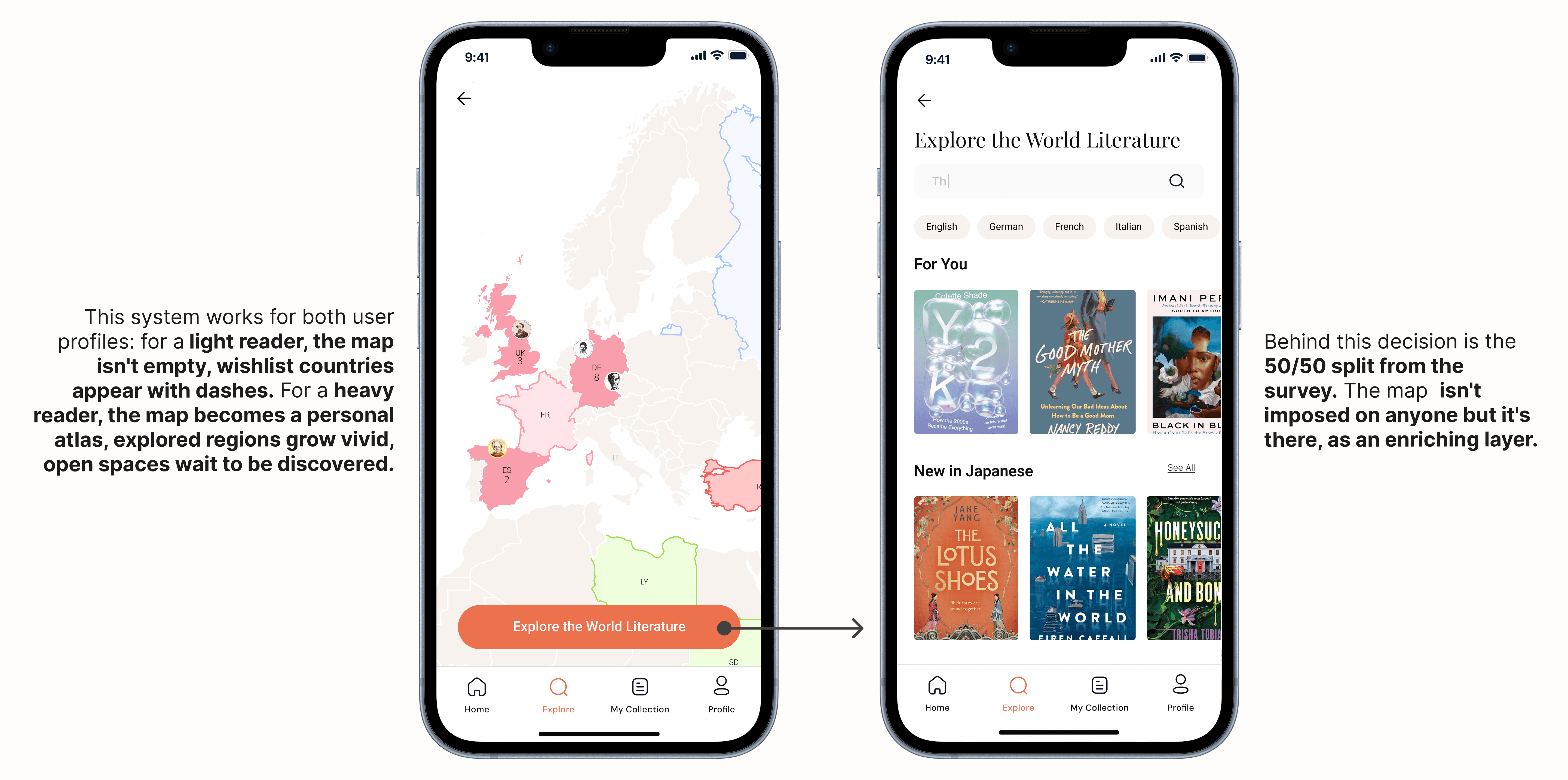
The map shouldn't be a mandatory, imposing layer, it should be an enriching visual layer that users can engage with if they choose. For users who don't care about geography, a classic list view should always be accessible.
This finding was initially jarring enough to make me question the entire map concept. But in the end, it led to a much better design decision:
The map shouldn't be a mandatory, imposing layer, it should be an enriching visual layer that users can engage with if they choose. For users who don't care about geography, a classic list view should always be accessible.
DEISGN
Onboarding
Onboarding
When the map first opened, it was empty. For a new user, this is a major broken promise. The app says "here's your reading map" but the screen is completely blank. That kills motivation and renders the concept meaningless. To prevent the reading map from opening completely blank, the onboarding flow collects a small amount of meaningful data before the user reaches the map.
When the map first opened, it was empty. For a new user, this is a major broken promise. The app says "here's your reading map" but the screen is completely blank. That kills motivation and renders the concept meaningless. To prevent the reading map from opening completely blank, the onboarding flow collects a small amount of meaningful data before the user reaches the map.

The user can select the literatures they want to explore, add the book they are currently reading, or optionally import their previous reading data from Goodreads. This way, the map feels alive from the first interaction. Instead of presenting an empty product promise, the experience gives users an immediate sense of progress, personalization, and motivation to continue exploring world literature.
Map Color System: Three Layers
Map Color System: Three Layers

In the first version, every read country filled with a single flat color. Simple, but not enough. It only told the user "read / not read" and nothing else. I landed on three meaningful states:

I built the color system around seven geographic regions rather than individual countries. All of Europe shares one color, all of Asia another. Assigning a unique color to every country would be both unmanageable and visually chaotic.
I built the color system around seven geographic regions rather than individual countries. All of Europe shares one color, all of Asia another. Assigning a unique color to every country would be both unmanageable and visually chaotic.
Recommendation Mechanism
Recommendation Mechanism
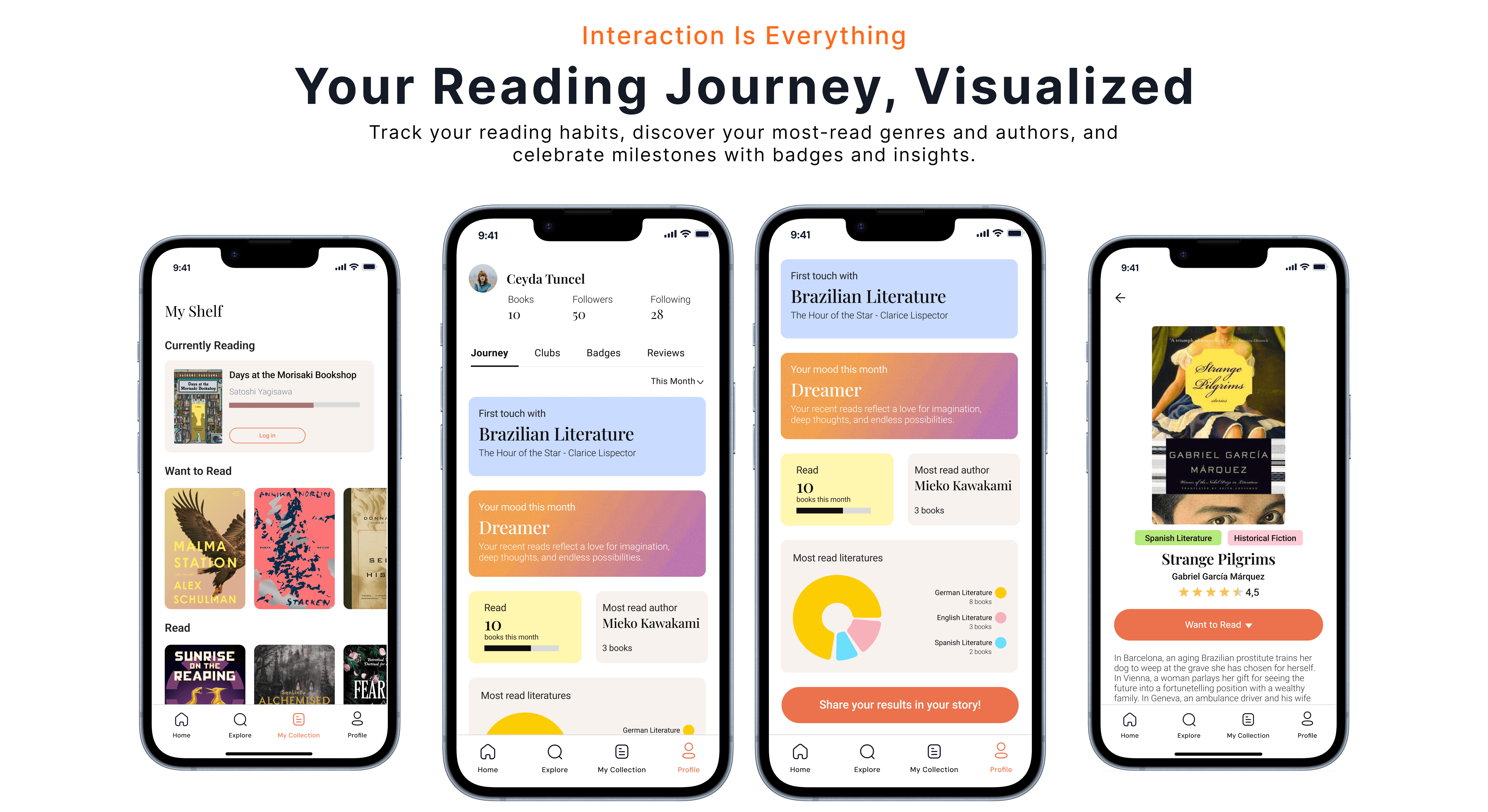
When designing the recommendation system, I asked myself: how do you make a recommendation that guides without creating choice paralysis? The classic book app answer: a list. 10–20 suggestions, scroll, pick. But that's exactly what the survey called "choice overload."
LitMap's answer is different: one recommendation, one shuffle button.
When designing the recommendation system, I asked myself: how do you make a recommendation that guides without creating choice paralysis? The classic book app answer: a list. 10–20 suggestions, scroll, pick. But that's exactly what the survey called "choice overload."
LitMap's answer is different: one recommendation, one shuffle button.


What I Learned
What I Learned
LitMap attempts to take reading habits out of list format and turn them into a personal world atlas. A motivation tool for light readers, a meaningful data experience for heavy ones.
The most valuable learning in this project came from research. When I first saw the 50/50 geographic split, I thought my core hypothesis had collapsed. But that finding actually led to a more honest design decision: the map isn't imposed on anyone, but it's there. Those who want it go deeper; those who don't switch to list view.
Research is done to be directed, not validated. This project made that clear.
Next steps: User testing to measure how the empty state and recommendation mechanism work in real use. Integrating a Goodreads import into onboarding. Building an interactive prototype of the core recommendation flow through vibe coding.
LitMap attempts to take reading habits out of list format and turn them into a personal world atlas. A motivation tool for light readers, a meaningful data experience for heavy ones.
The most valuable learning in this project came from research. When I first saw the 50/50 geographic split, I thought my core hypothesis had collapsed. But that finding actually led to a more honest design decision: the map isn't imposed on anyone, but it's there. Those who want it go deeper; those who don't switch to list view.
Research is done to be directed, not validated. This project made that clear.
Next steps: User testing to measure how the empty state and recommendation mechanism work in real use. Integrating a Goodreads import into onboarding. Building an interactive prototype of the core recommendation flow through vibe coding.
Explore Other Projects

Voxvil.com - Seller Panel Flow Design: Designing For Non-Tech User
Product Design
End-to-end Design
E-commerce
Iteration Process
Voxvil is a print-on-demand platform where artists sell their designs on physical products. The seller panel was redesigned end-to-end, from the design upload flow to product detail pages and pricing, to help artists set up and manage their store with less friction and more confidence at every step.
Voxvil is a print-on-demand platform where artists sell their designs on physical products. The seller panel was redesigned end-to-end, from the design upload flow to product detail pages and pricing, to help artists set up and manage their store with less friction and more confidence at every step.

CEKULvakfi.org - Restructuring Navigation and Visual Hierarchy
CEKULvakfi.org - Restructuring Navigation and Visual Hierarchy
Information Architecture
Web Redesign
End-to-end Design
The ÇEKÜL Foundation website was redesigned to transform a content-heavy structure into a simpler, scalable digital experience. Navigation was consolidated, programme pages were visually separated, and page structures were rebuilt to help users move through content without getting lost.
The ÇEKÜL Foundation website was redesigned to transform a content-heavy structure into a simpler, scalable digital experience. Navigation was consolidated, programme pages were visually separated, and page structures were rebuilt to help users move through content without getting lost.

Bidolubaskı.com - Card and Checkout Flow Redesign
Bidolubaskı.com - Card and Checkout Flow Redesign
E-commerce
Web Redesign
Checkout Flow
Bidolubaski.com's checkout was redesigned to handle mixed print product orders. Sequential steps, one clear purpose each, with post-purchase instructions that adapted to the user's situation.
Bidolubaski.com's checkout was redesigned to handle mixed print product orders. Sequential steps, one clear purpose each, with post-purchase instructions that adapted to the user's situation.