CEKUL VAKFI - Restructuring Navigation and Visual Hierarchy
CEKUL VAKFI - Restructuring Navigation and Visual Hierarchy
SCOPE
Web
COMPANY
OctoHaus
YEAR
2024
In the redesign of the ÇEKÜL Foundation website, I focused on transforming the content-heavy structure into a simpler, more understandable, and scalable digital experience. I contributed to simplifying the navigation structure, visually separating program pages, and creating page structures that allow users to navigate more easily between content.

My Role
My Role
I contributed to the UX and UI design of the ÇEKÜL Vakfı website redesign as part of a design team. My work focused on the navigation structure and visual execution of the program pages, translating the foundation's renewed identity into a coherent digital experience across a content-heavy platform.
I contributed to the UX and UI design of the ÇEKÜL Vakfı website redesign as part of a design team. My work focused on the navigation structure and visual execution of the program pages, translating the foundation's renewed identity into a coherent digital experience across a content-heavy platform.
PROBLEM STATEMENT
Challenge
Challenge
The existing site had accumulated decades of content without the structure to support it. Two navigation layers competed at the top of every page. Program pages all looked identical, giving users no visual sense of where they were or how programs differed from one another. Inner pages relied on heavy left sidebars that made content hard to scan and navigate.
Beyond the structural issues, ÇEKÜL operates across 7 distinct program areas, each with its own audience and purpose. A first-time visitor trying to understand the foundation's work and a returning supporter looking to donate were navigating the same undifferentiated experience. The site needed to serve both without losing either.
The existing site had accumulated decades of content without the structure to support it. Two navigation layers competed at the top of every page. Program pages all looked identical, giving users no visual sense of where they were or how programs differed from one another. Inner pages relied on heavy left sidebars that made content hard to scan and navigate.
Beyond the structural issues, ÇEKÜL operates across 7 distinct program areas, each with its own audience and purpose. A first-time visitor trying to understand the foundation's work and a returning supporter looking to donate were navigating the same undifferentiated experience. The site needed to serve both without losing either.

Old Design

New Design
IDEATION
Process
Process
The project started from a brief and a deep look at the existing site. Rather than conducting formal user research, the team drew on the foundation's own understanding of its audiences and content and on what the old site made painfully visible: too much information, not enough structure.
The redesign was approached in layers. First, the navigation and information architecture; what goes where, and how users move between sections. Then, the visual language; how the new brand identity translates into a digital system that could scale across 7 programs. These two decisions shaped everything else.
The project started from a brief and a deep look at the existing site. Rather than conducting formal user research, the team drew on the foundation's own understanding of its audiences and content and on what the old site made painfully visible: too much information, not enough structure.
The redesign was approached in layers. First, the navigation and information architecture; what goes where, and how users move between sections. Then, the visual language; how the new brand identity translates into a digital system that could scale across 7 programs. These two decisions shaped everything else.

Before designing a single screen, the full information architecture was mapped, 7 sections, 40+ pages, each with defined content structure.
Before designing a single screen, the full information architecture was mapped, 7 sections, 40+ pages, each with defined content structure.
SOLUTION #1
Simplifying Navigation
Simplifying Navigation
The existing site had two competing navigation layers. The top bar carried the main menu Hakkımızda, Haberler, Makaleler and so on. Below it, a second full-width bar listed all of ÇEKÜL's individual programmes, effectively creating a parallel navigation with no clear hierarchy between them. Users had no consistent way to understand what was primary and what wasn't.
The redesign collapsed this into a single primary navigation with four grouped categories. Secondary actions like social media links, the shop, and the newsletter were moved to a utility bar above, separating wayfinding from destination.
The existing site had two competing navigation layers. The top bar carried the main menu Hakkımızda, Haberler, Makaleler and so on. Below it, a second full-width bar listed all of ÇEKÜL's individual programmes, effectively creating a parallel navigation with no clear hierarchy between them. Users had no consistent way to understand what was primary and what wasn't.
The redesign collapsed this into a single primary navigation with four grouped categories. Secondary actions like social media links, the shop, and the newsletter were moved to a utility bar above, separating wayfinding from destination.

Old Design
Old Design

New Design
New Design
The same problem, across every inner page
The same problem, across every inner page
Every inner page followed the same pattern: a left sidebar carrying the full section menu, competing with the main content for attention. The sidebar didn't help users navigate, it added noise before they even reached what they came for.
The Akademi page is one example. The sidebar was removed, section context moved into the persistent top navigation, and the page was restructured to lead with content. Training content is now organized by audience and program type, accessible directly from the page.
Every inner page followed the same pattern: a left sidebar carrying the full section menu, competing with the main content for attention. The sidebar didn't help users navigate, it added noise before they even reached what they came for.
The Akademi page is one example. The sidebar was removed, section context moved into the persistent top navigation, and the page was restructured to lead with content. Training content is now organized by audience and program type, accessible directly from the page.

Before
Before

After
After
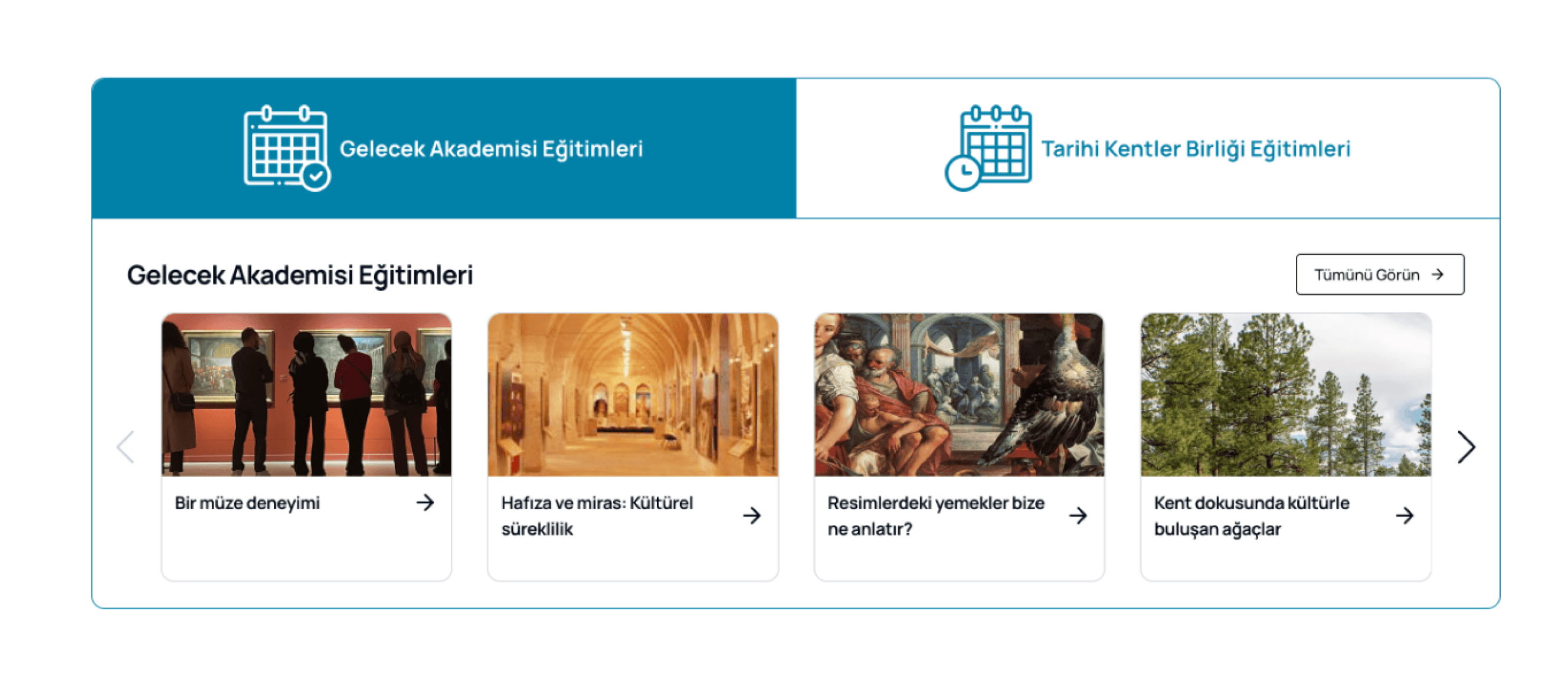
Contextual content components were added to each page based on what users needed next without relying on a sidebar to carry the full menu.
Contextual content components were added to each page based on what users needed next without relying on a sidebar to carry the full menu.
Same structure, different page
Same structure, different page
The donation page followed the same pattern: a yellow sidebar listing every donation option, a dense text block, and bank account details stacked at the bottom. The page asked users to process too much before they could act.
The new page leads with a clear headline, organizes giving options as scannable cards, and moves the bank details below the fold, visible when needed, not competing for attention from the start.
The donation page followed the same pattern: a yellow sidebar listing every donation option, a dense text block, and bank account details stacked at the bottom. The page asked users to process too much before they could act.
The new page leads with a clear headline, organizes giving options as scannable cards, and moves the bank details below the fold, visible when needed, not competing for attention from the start.

Before
Before

After
After
SOLUTION #2
Program Color System & Contextual Navigation
Program Color System & Contextual Navigation
ÇEKÜL operates across 9 distinct program areas but the old site made them all look identical. Same layout, same accent color, no visual distinction between programs.
ÇEKÜL operates across 9 distinct program areas but the old site made them all look identical. Same layout, same accent color, no visual distinction between programs.


Before
Each program was assigned a distinct color, applied consistently across its header, navigation elements, and action buttons. A user reading about reforestation and a user exploring cultural heritage now have completely different visual contexts and always know exactly where they are.
Each program was assigned a distinct color, applied consistently across its header, navigation elements, and action buttons. A user reading about reforestation and a user exploring cultural heritage now have completely different visual contexts and always know exactly where they are.

Each program carries its own color applied consistently across navigation, headers, and cards
Each program carries its own color applied consistently across navigation, headers, and cards


The system scales across the whole site
The system scales across the whole site
The color system wasn't limited to program pages. Every cross-linking component —CTAs, promotional blocks, and editorial sections on the homepage— inherits the color of the program it points to. A block promoting Bilgi Ağacı content appears in teal. A publishing section appears in blue. Users don't need to read the label to understand the context, the color does it first.
The color system wasn't limited to program pages. Every cross-linking component —CTAs, promotional blocks, and editorial sections on the homepage— inherits the color of the program it points to. A block promoting Bilgi Ağacı content appears in teal. A publishing section appears in blue. Users don't need to read the label to understand the context, the color does it first.


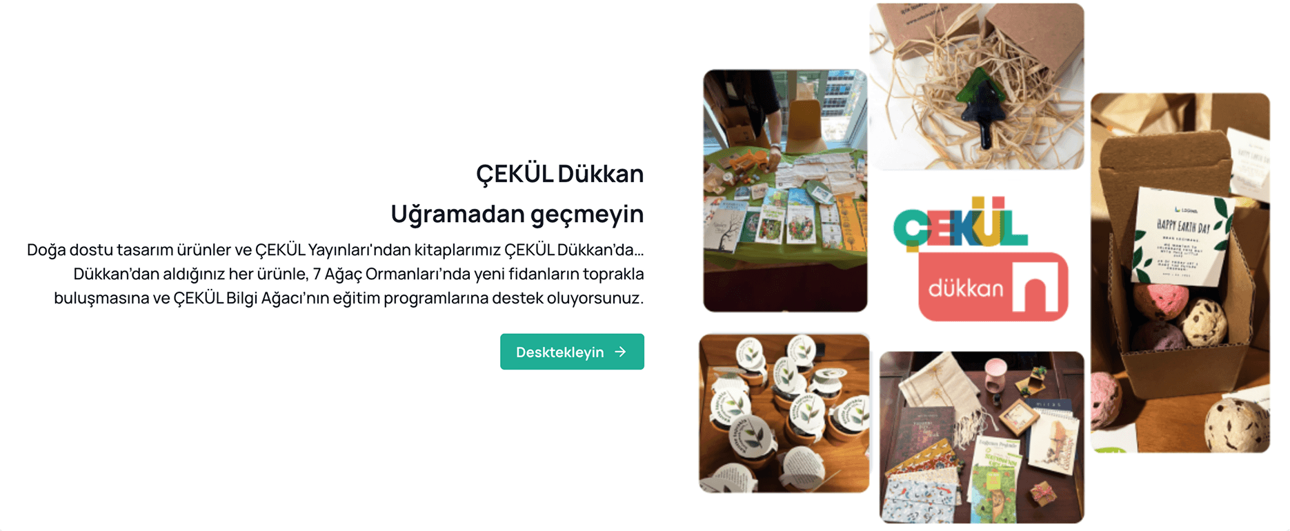
Homepage components inherit program colors the system works without any extra navigation cues.
Homepage components inherit program colors the system works without any extra navigation cues.
What I Learned
What I Learned
More information isn't always better. The most valuable thing I took from this project wasn't technical. It was knowing what to take out, not just what to put in.
Working with an institution like ÇEKÜL also shifted how I think about users. The person arriving at the site isn't the only one you're designing for. A foundation has its own internal logic, its own language, its own priorities and those matter too. Learning to hold both at once, the institution's identity and the visitor's needs, was something I hadn't encountered in the same way before.
Navigation was the clearest example, but the same question sat underneath every decision. What do you show, what do you leave out, how do you order what remains. I kept coming back to that throughout the project.
More information isn't always better. The most valuable thing I took from this project wasn't technical. It was knowing what to take out, not just what to put in.
Working with an institution like ÇEKÜL also shifted how I think about users. The person arriving at the site isn't the only one you're designing for. A foundation has its own internal logic, its own language, its own priorities and those matter too. Learning to hold both at once, the institution's identity and the visitor's needs, was something I hadn't encountered in the same way before.
Navigation was the clearest example, but the same question sat underneath every decision. What do you show, what do you leave out, how do you order what remains. I kept coming back to that throughout the project.
Explore Other Projects

LitMap - Visualising Reading Habits as a Personal World Map
LitMap - Visualising Reading Habits as a Personal World Map
Product Design
Data Visualization
User Research
Concept Design
LitMap is a concept mobile app that turns reading history into a personal world map. Users can discover new literature by geography, track which countries they have explored, and build a visual atlas of their reading life, making progress feel meaningful rather than just a number on a list.
LitMap is a concept mobile app that turns reading history into a personal world map. Users can discover new literature by geography, track which countries they have explored, and build a visual atlas of their reading life, making progress feel meaningful rather than just a number on a list.

CEKULvakfi.org - Restructuring Navigation and Visual Hierarchy
CEKULvakfi.org - Restructuring Navigation and Visual Hierarchy
Information Architecture
Web Redesign
End-to-end Design
The ÇEKÜL Foundation website was redesigned to transform a content-heavy structure into a simpler, scalable digital experience. Navigation was consolidated, programme pages were visually separated, and page structures were rebuilt to help users move through content without getting lost.
The ÇEKÜL Foundation website was redesigned to transform a content-heavy structure into a simpler, scalable digital experience. Navigation was consolidated, programme pages were visually separated, and page structures were rebuilt to help users move through content without getting lost.

Voxvil.com - Seller Panel Flow Design: Designing For Non-Tech User
Product Design
End-to-end Design
E-commerce
Iteration Process
Voxvil is a print-on-demand platform where artists sell their designs on physical products. The seller panel was redesigned end-to-end, from the design upload flow to product detail pages and pricing, to help artists set up and manage their store with less friction and more confidence at every step.