
Seller Panel Flow Design: Designing For Non-Tech User

Seller Panel Flow Design: Designing For Non-Tech User

Seller Panel Flow Design: Designing For Non-Tech User

SCOPE

Responsive Web

COMPANY

OctoHaus

YEAR

2025

Overview

Overview

Voxvil is a print-on-demand marketplace where independent artists can turn their digital artwork into physical products and sell them without managing production, inventory or shipping. The project focused on redesigning the seller panel—from design upload and product placement to pricing and store management—to make unfamiliar e-commerce tasks clearer and easier to complete.

Voxvil is a print-on-demand marketplace where independent artists can turn their digital artwork into physical products and sell them without managing production, inventory or shipping. The project focused on redesigning the seller panel—from design upload and product placement to pricing and store management—to make unfamiliar e-commerce tasks clearer and easier to complete.

My Role

My Role

I was responsible for the seller-facing experience, designing the tools artists use to set up and manage their stores. My scope included the store management dashboard, design upload and product creation flows, pricing, the collection feature from concept to launch, and product detail pages.

HOW WE IDENTIFIED THE PROBLEM

1- Incomplete product creation

Some artists successfully opened their stores and uploaded their designs, but did not continue through product placement and publishing. This indicated that the main friction occurred after the initial setup, when artists had to turn their artwork into a sellable product.

HOW WE IDENTIFIED THE PROBLEM

2- Recurring support request

Support tickets also revealed a consistent pattern. Although they came from different users, many focused on the same tasks and questions rather than isolated technical issues.

When we examined these signals together, we realised that they were not isolated usability issues. They pointed to a gap between our initial assumptions about artists and their actual familiarity with e-commerce workflows.

Vicky - Digital Illustrator

“I want to sell my designs, but it’s very difficult to find time for production with shipping, stock, and printing.”

Goals

Selling designs without operational burden

Generating passive income

Focusing on creative practice

Pain Points

Not knowing the e-commerce ecosystem

Not being able to manage stock, shipping, and packaging processes

Selling via Instagram DM, not scaling

Initial Persona

Vicky - Digital Illustrator

“I know how to create the artwork, but I need clear guidance to turn it into a sellable product and understand what to do next.”

Goals

Completing product creation with confidence

Understanding store status and next steps

Making informed pricing decisions

Managing the store independently

Pain Points

Unclear next actions in the seller dashboard

Difficulty applying designs correctly to products

Uncertainty around pricing and potential earnings

Insufficient guidance during unfamiliar tasks

Updated Understanding

Needs an easier way to sell artwork


Does not know the e-commerce ecosystem


Wants to avoid operational work


Values a simple experience

Needs step-by-step guidance to create sellable products


Needs unfamiliar e-commerce concepts explained in context


Also wants visibility into store status, pricing and earnings


Values clarity and feedback over extreme minimalism

SOLUTION

Redesigning the Critical Seller Experience

Based on these insights, we revisited the four parts of the seller experience where artists needed the most clarity: the dashboard, design upload, product placement and pricing.

SOLUTION #1

Seller Dashboard

Based on these insights, we revisited the four parts of the seller experience where artists needed the most clarity: the dashboard, design upload, product placement and pricing.

Before

Limited store snapshot

Before

Limited store snapshot

After

Turning a limited overview into an actionable workspace

After

Turning a limited overview into an actionable workspace

SOLUTION #2

Design Upload

Artists could upload their designs, but the initial flow provided little guidance on how to prepare files correctly or what the system expected before continuing.

First Design

First Design

Single-page upload form with minimal structure. Artists could fill in the fields, but had no guidance on what the system expected at each step.

Single-page upload form with minimal structure. Artists could fill in the fields, but had no guidance on what the system expected at each step.

Iteration 1

Iteration 1

Added a contextual warning panel on the right, highlighting what to watch out for based on the uploaded design. Supporting info text below for additional guidance.

Added a contextual warning panel on the right, highlighting what to watch out for based on the uploaded design. Supporting info text below for additional guidance.

Iteration 2 → Final Design

Iteration 2 → Final Design

Guidance and upload actions were reorganised into two clear areas. A visual checklist explained preparation requirements, while the focused form made the next action easier to identify.

Guidance and upload actions were reorganised into two clear areas. A visual checklist explained preparation requirements, while the focused form made the next action easier to identify.

SOLUTION #3

Product Placement

Artists had to position designs visually with limited controls and repeatedly switch between editing and previewing, making product creation difficult to complete with confidence.
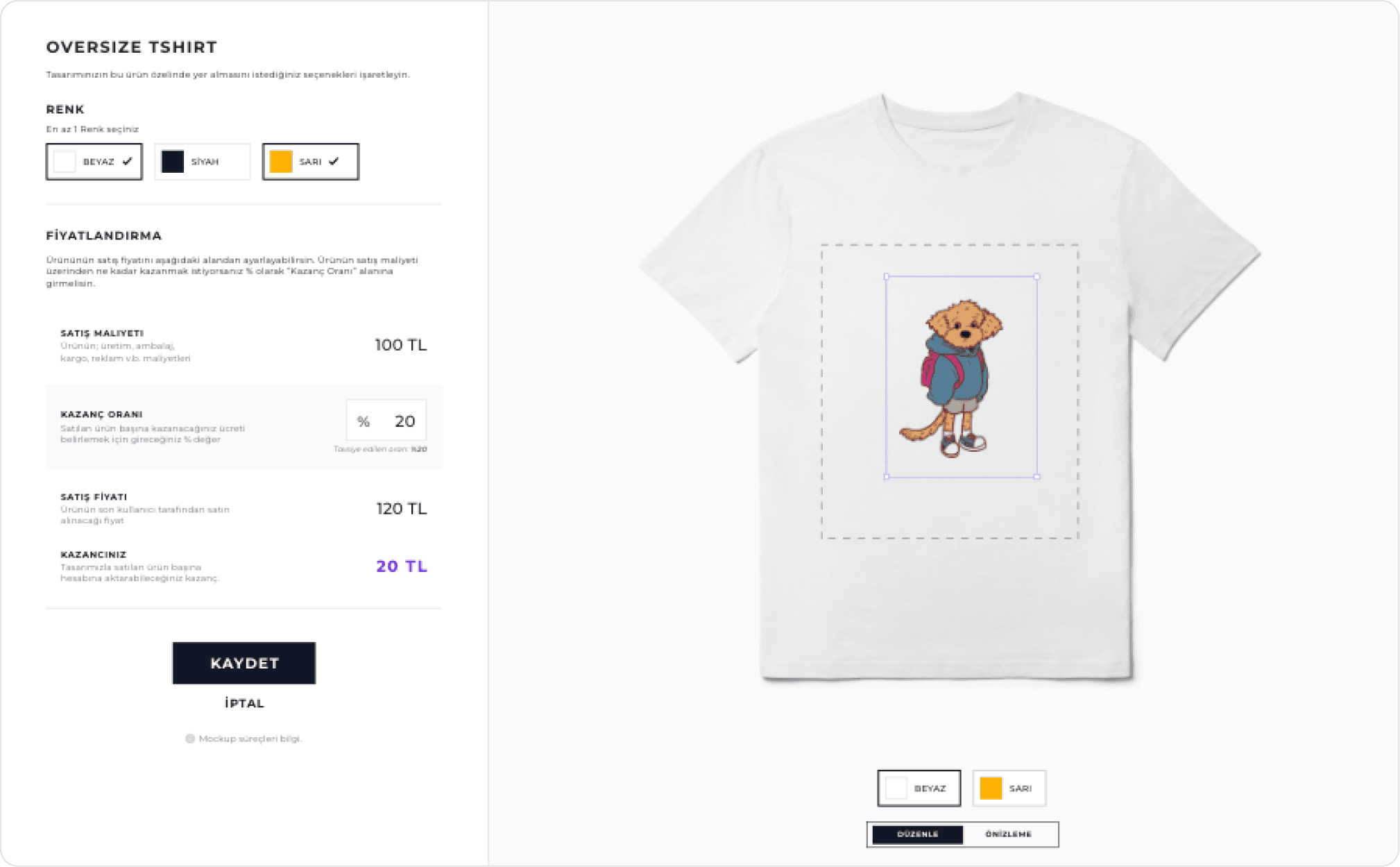
First Design

First Design

Artists placed their design by eye with no positional controls, only colour selection and pricing. Editing required switching between "Edit" and "Preview" modes, breaking the flow.

Artists placed their design by eye with no positional controls, only colour selection and pricing. Editing required switching between "Edit" and "Preview" modes, breaking the flow.

Iteration 1

Iteration 1

Alignment, sizing and print-area controls were added, while a persistent preview showed the result of each decision. However, the growing left panel made the form too long.

Alignment, sizing and print-area controls were added, while a persistent preview showed the result of each decision. However, the growing left panel made the form too long.

Iteration 2 -> Final Design

Iteration 2 -> Final Design

Placement controls were moved directly onto the product preview, creating a more immediate connection between each action and its visual result. The left panel was shortened to keep product options and pricing easier to scan.

Placement controls were moved directly onto the product preview, creating a more immediate connection between each action and its visual result. The left panel was shortened to keep product options and pricing easier to scan.

SOLUTION #4

Pricing

Artists could enter a profit rate, but struggled to understand how that percentage affected the final sale price and the amount they would actually earn.

First Design

First Design

Cost, profit rate, sale price and earnings were presented as separate rows. Although the information was available, the relationship between the input and its outcome was difficult to scan.

Cost, profit rate, sale price and earnings were presented as separate rows. Although the information was available, the relationship between the input and its outcome was difficult to scan.

Final Design

Final Design

Pricing was reorganised around a single decision: the profit rate. Cost, sale price and earnings were grouped into an immediate summary, making the financial outcome of each change easier to understand.

Pricing was reorganised around a single decision: the profit rate. Cost, sale price and earnings were grouped into an immediate summary, making the financial outcome of each change easier to understand.

Outcome

Outcome

The redesigned experience was released iteratively across the seller dashboard, design upload, product placement and pricing flows. Following the release, we observed more artists progressing through product creation and completing key seller tasks independently. Recurring support requests around these flows also became less frequent. Although these outcomes were not tracked through a formal quantitative measurement framework, the change was visible through live product usage and the support patterns we continued to follow after release.

What I Learned

What I Learned

This project reinforced something important: user behavior and user identity are not the same thing. Knowing who your user is gets you to the right problem. Knowing how they behave gets you to the right solution.


A lesson stayed with me. Reducing steps in a flow doesn't automatically reduce friction. What matters is whether each remaining step is clear enough to act on. Also users make decisions based on what they can see. When information is missing the gap doesn't disappear, it just moves to a support ticket.


The iteration process, identifying friction points through real usage data and responding with targeted design changes, is what moved the experience forward. That kind of feedback loop, between real usage and design decisions, is now central to how I approach every project.

This project reinforced something important: user behavior and user identity are not the same thing. Knowing who your user is gets you to the right problem. Knowing how they behave gets you to the right solution.


A lesson stayed with me. Reducing steps in a flow doesn't automatically reduce friction. What matters is whether each remaining step is clear enough to act on. Also users make decisions based on what they can see. When information is missing the gap doesn't disappear, it just moves to a support ticket.


The iteration process, identifying friction points through real usage data and responding with targeted design changes, is what moved the experience forward. That kind of feedback loop, between real usage and design decisions, is now central to how I approach every project.

Explore Other Projects

LitMap - Visualising Reading Habits as a Personal World Map

LitMap - Visualising Reading Habits as a Personal World Map

Product Design

Data Visualization

User Research

Concept Design

LitMap is a concept mobile app that turns reading history into a personal world map. Users can discover new literature by geography, track which countries they have explored, and build a visual atlas of their reading life, making progress feel meaningful rather than just a number on a list.

LitMap is a concept mobile app that turns reading history into a personal world map. Users can discover new literature by geography, track which countries they have explored, and build a visual atlas of their reading life, making progress feel meaningful rather than just a number on a list.

CEKULvakfi.org - Restructuring Navigation and Visual Hierarchy

CEKULvakfi.org - Restructuring Navigation and Visual Hierarchy

Information Architecture

Web Redesign

End-to-end Design

The ÇEKÜL Foundation website was redesigned to transform a content-heavy structure into a simpler, scalable digital experience. Navigation was consolidated, programme pages were visually separated, and page structures were rebuilt to help users move through content without getting lost.

The ÇEKÜL Foundation website was redesigned to transform a content-heavy structure into a simpler, scalable digital experience. Navigation was consolidated, programme pages were visually separated, and page structures were rebuilt to help users move through content without getting lost.

Bidolubaskı.com - Card and Checkout Flow Redesign

Bidolubaskı.com - Card and Checkout Flow Redesign

E-commerce

Web Redesign

Checkout Flow

Bidolubaski.com's checkout was redesigned to handle mixed print product orders. Sequential steps, one clear purpose each, with post-purchase instructions that adapted to the user's situation.

Bidolubaski.com's checkout was redesigned to handle mixed print product orders. Sequential steps, one clear purpose each, with post-purchase instructions that adapted to the user's situation.

Let’s contact!

Let’s contact!

© 2025 Ceyda Tuncel